[ad_1]
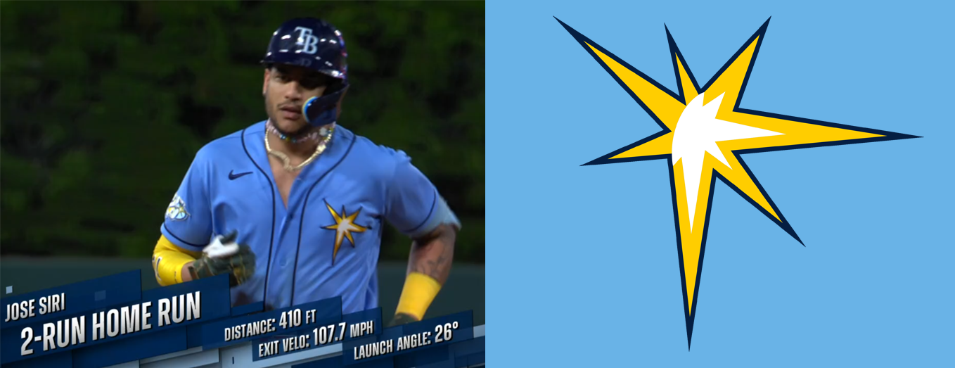
This all started because I was staring at Jose Siri. I don’t think I’ve ever set out with the intention of staring at Jose Siri, but it ends up happening kind of a lot. He’s very watchable. He runs like the wind, if the wind had big muscles. He swings with a righteous fury, and on the rare occasions when he connects with the baseball, he threatens to reduce it to a smoking heap of carbonized yarn. He throws hard too, but not hard enough to wax poetic about it.
A few weeks ago, I was researching tromps and whomps (you know, baseball stuff) when I noticed the emblem on Siri’s jersey. It wasn’t the entire Rays logo. It was just a tiny part of it meant to symbolize the whole. Jose Siri was wearing a metonym. I started wondering about that yellow starburst design: where it came from, what it was supposed to be, and how long I’d been staring at it without actually seeing it.
Despite the bright colors, Tampa Bay’s Columbia Blue alternates are the sparsest jerseys in baseball. No other team has a jersey whose front features a graphic with no characters whatsoever. Few teams in the history of the league have worn jerseys like that, and when they did, the graphics were much more representational than the asymmetrical sunburst shape that Tampa Bay uses to evoke a ray of sunshine.
Over the past few weeks, I spoke to several people with knowledge of the intersection between art, graphic design, and baseball. I was also lucky enough to speak to two of the people who created the logo in the first place.
As it turns out, that piece of the logo is called “the glint,” and it was born on a rooftop in New Jersey.
I first spoke to artist Graig Kreindler. He hadn’t noticed the jerseys either, and he gamely agreed to let me send him some pictures the moment before we got on the phone so that he could give me his reaction in real time. Kreindler loved the jerseys.
“I had no idea that they’d gotten rid of the type altogether,” he said. “I love that idea of having your visual identity tied around something… that in this case is pretty abstract.” Kreindler specializes in gorgeously detailed paintings of baseball players and scenes, usually from previous eras.
When I asked him whether he could think of anything comparable to the Rays jerseys, he brought up the Philadelphia Athletics of the 1920s, whose jerseys had an elephant on the breast, and who were apparently forbidden from smiling.
“Anything that makes me think of something vintage,” said Kreindler, “I’m all for it.” As a painter rather than a graphic designer, he was also acutely aware of how challenging this logo must have been to come up with. “I guess it’s kind of hard to make a shape —” he started, but then he cut himself off. “How do you illustrate rays of the sun?” It’s a good point.
After all, until a ray of sunshine hits something, it’s just a line. It’s hard to make that fun enough to put on a hat or a jersey. Still, there are plenty of wrong ways to answer the question. Just ask the Hagerstown Suns, who decided to lean into their name and ended up going full-on Raisin Bran.
MLB teams don’t just pick their own logos. The league has a carefully curated aesthetic, overseen by the internal MLB Design Services team. Some clubs have been around since the 19th century, and anything new needs to be of a piece with what came before, as well as with the league’s vision for the future. And there is more new design work than you might realize.
Each season, there are a million things that require branding: the All-Star Game, the World Series, spring training, each round of the playoffs, the Home Run Derby, All-Star workout day, the Futures Game. Even the Winter Meetings get a new logo every year.
Long before Tampa Bay picked just a portion of its visual identity to focus on, it did the same thing with its name. From the franchise’s 1998 debut to 2007, the Devil Rays ran the worst record in baseball and finished last in the AL East nine times.
When Stu Sternberg assumed full ownership of the team in 2005, it was in need of an exorcism. Whether or not it had anything to do with complaints from religious groups, Sternberg’s top-to-bottom reinvention of the franchise included a name change. Before the 2008 season, Tampa Bay dropped the word Devil and set out to rebrand around the idea of rays of sunshine. They were no longer fish; they were photons. (The devil can be hard to renounce, though.
Rather than shell out for new uniforms, the team’s Appalachian League affiliate in Princeton, West Virginia, stayed the Devil Rays for an extra year.) That history has colored how some people view the rebrand.
Sarah Ingber is an artist who worked on the Too Far From Town project at Baseball Prospectus. When she looks at the new logo, her first association is a religious one: the Star of Bethlehem. However, she readily admits that the origin of the name change left her biased. “Devil Rays are a weird team name but cool animal,” she told me. “They can’t help their little head shapes. Justice for satanic nomenclature!”
Once the decision to cast out the devil had been made, MLB brought on FanBrandz, a sports branding agency run by Bill Frederick, to create the visual identity for the Rays. A team of four or five people worked on the project, with MLB vice president of design Anne Occi essentially acting as creative director. It was the first big project Maureen Raisch, a designer not long out of college, had worked on.
“They really threw me in the deep end creatively, which was really exciting,” she said. Raisch and Frederick explained that Sternberg, a Brooklyn native who grew up worshipping Sandy Koufax, had a very specific aesthetic in mind. “In the meetings, he really wanted the sophistication of the Yankees uniform,” said Frederick. “So that really drove the process.”
The futuristic fonts and rainbow gradients of the Devil Rays were out. Navy blue was in. “Classic typography,” explained Raisch, “you want that in baseball. It’s right at home in the aesthetic of MLB.” However, she drew the line when there was talk of pinstripes. “Do not do it. You cannot,” she remembered thinking. “For God’s sake, you’re in the division with the Yankees!”
“I think that the glint came very, very late in the process,” said Frederick. “We had done quite a bit of exploration at that point.” His team had tried out concepts using sunbeams to create the leg of the R in Rays, or coming through the wordmark. “We had done some stuff that was very expressive, and it was determined that it really should become much more sophisticated.”
Eventually, they hit on the winner. Said Raisch, “These classic baseball letter forms were going to be the thing. You kind of knew that.” That simpler design “needed that little special thing.” The idea for the glint arose during a meeting at MLB’s New York office in early January 2008. “We had this meeting, just up here on Park Ave,” said Raisch. “And something in this meeting sparked, where I go, “I know what we’re going to do.”
“We had played around a lot with it,” said Frederick. “And it just occurred to us at some point, and I think it was probably with Maureen. We said, ‘Well, what about what the sun does to the type?’ It actually reflects off the type, as opposed to trying to image sunbeams. And then Maureen basically took it on herself.”
Rather than simply draw a cartoon glint, Raisch preferred to work from real life. “I think it speaks to the way I approach creative work in sports,” she said. “I think everything should be kind of grounded in reality. Reality is what is familiar to the human eye, so you can’t…
[ad_2]